Blog
Relay Brand Update
Over the past year we’ve made incremental updates to our visual styling to better reflect the evolution of our company, and to create a more modern design system — a requirement in today’s digital landscape. We’re excited to share the launch of our updated identity, and some of the thinking behind the changes too. Relay has always been driven by innovation and growth. And as we celebrate our ten year anniversary, we’re making sure that the way we present ourselves reflects the vision of our business, platform, and team.
Background
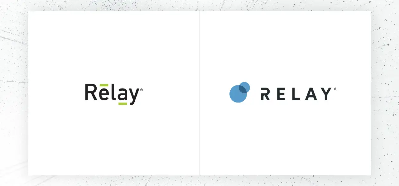
Our original logo was designed to represent the transfer of data. Tech green was our brand’s primary color, and we used it successfully to stand out from our peers. For a new startup on the scene, it did its job well in communicating the charged energy felt with every new feature release and company milestone. So why did we feel the need to update our identity?

Over time, we got better at what we did. Our Product and Engineering teams built innovations and features that grew the Relay platform at a rapid pace. Client Success had the data and analytics to build beautiful customer experiences proven to increase engagement. And our Sales team refined their industry expertise, adept at identifying opportunities to create the most value for businesses. We were helping our clients engage their customers with the only channel designed specifically for the customer experiences.
Through our growth, the company vision stayed true. Relay is dedicated to pulling out the friction in customer experiences to drive better outcomes for our clients. That enduring focus on the human relationship makes all the difference in our platform, and we wanted our updated identity to represent it.
Renewed focus
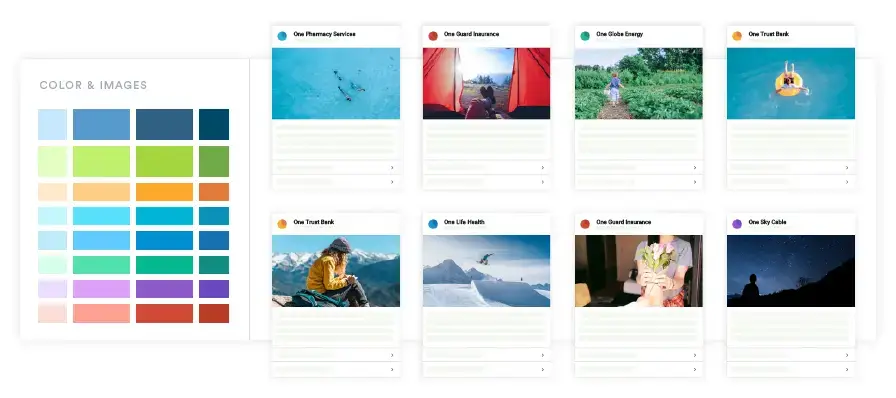
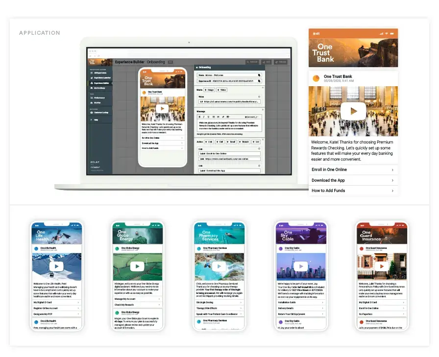
Over the last year, we added new visual elements to broaden our identity system. With a new website came a new typeface and expanded color palette to support our signature green. Our imagery moved from a technology focus to one that showed the Relay difference in the client and customer relationship. This got us started on a path of self-reflection as we took a critical look at everything from marketing material to internal communications.
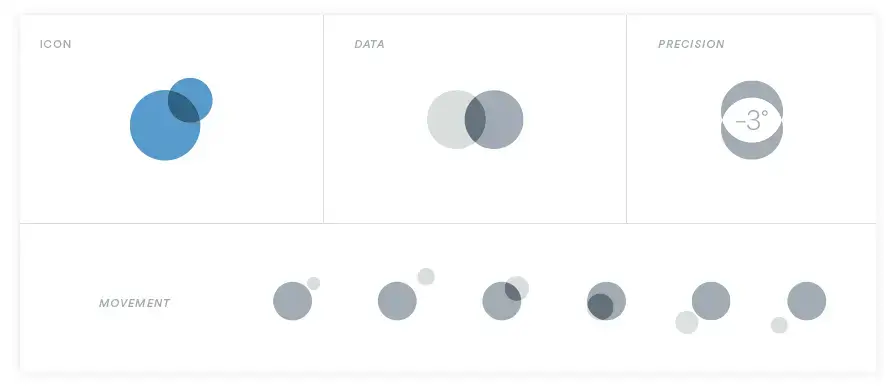
As a team, we went through brand discovery and exploration exercises that helped us determine exactly what we wanted out of an updated identity: a logo, icon, and identity system that was flexible in its application and uniquely Relay.
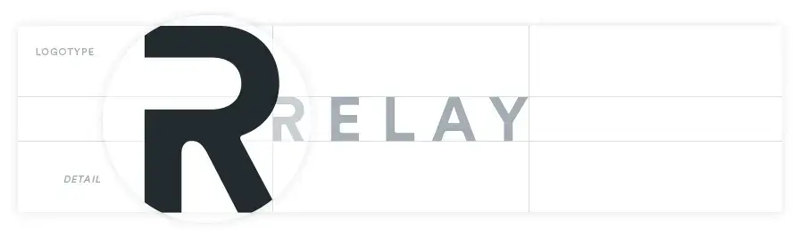
We redesigned our logo with a new typeface and details to make it our own. We added a new icon that drew on the idea of relationships, represented technically. Inspiration came from the innovation that sent man to the moon, and the teamwork that launched orbiting satellites to relay information all over the Earth. That spirit of discovery resonated with us.
What’s next?
Though we have a fresh new look, the commitment to our clients and their customers hasn’t changed. We have exciting new features on the horizon that bring substantive updates to our platform. And continue to add talented minds to our leadership team with the experience to support our explosive growth trajectory.

We hope you enjoy our updated identity and look forward to your feedback. Let us know what you think!